Thursday, 8 March 2012

Chosen Magazine: Lula

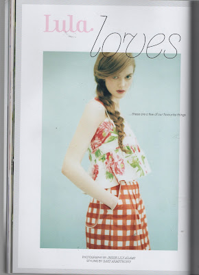
I decided to choose Lula as my magazine. I feel the look of my shoot works really well with this type of magazine. The images in Lula are very vintage, girly and simple looking which I love. Its very Dreamy, whimsical and quirky, Lula Magazine's pages consist of gorgeous fashion, kooky articles and art work presented from a wide variety of illustrators, journalists and creators

Ive never brought Lula magazine before but will definitely be buying it again.


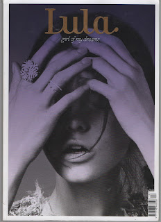
These images are from issue 12 called 'girl of my dreams'.


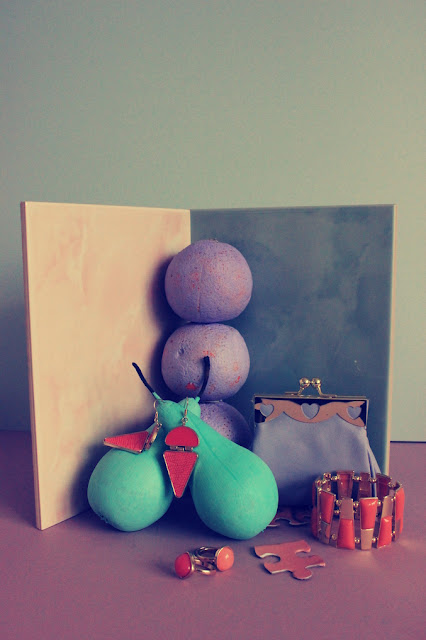
My favorite article is the one above and below. The use of colours within the images such as the pastel pinks and greens really link into my final photographs from my own shoot.


I like how the images are laid out above. This is something I will consider when re-editing my final images for my portfolio. 

---------------------------------------------------------------------------------------------


Monday, 5 March 2012

Final Images: Edited Further


Image one...

Image two...

Image three...

Image 4...

Image 5...

Here are my final images. After hours of editing I am now finally happy with the look of all my images my favorite being image 2.

Saturday, 3 March 2012

Final Shots.

First edit.
I  first started to edit my images in this way however decided to go against this look. I wanted my images to look very retro. I feel some look too dark and didn't quite work as well together. I also felt it went against my idea of using pastel colours. The images when edited in this way were very bright . However I do really like this technique and will consider using it again in future projects.


Thursday, 1 March 2012

Chosen Jigsaw Puzzle.

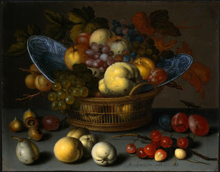
Originally I would have liked to use a jigsaw with the picture being a painting of fruit displayed in a fruit bowl. I wanted it to be very antique looking. However after searching many charity shops I found nothing similar to this


I decided to create my own using a cardboard jigsaw template. The jigsaw would only be seen in the images ever so slightly. I used two images which I had taken myself and changed my idea completely. It was very tricky making my own and extremely time consuming. It was very hard to make sure the image covered the whole jigsaw piece perfectly.


Here are the two images I chose to cover my jigsaw pieces.

1.

2.

Wednesday, 29 February 2012

Props for the Shoot.

I chose enough accessories for 5 different shots. I wanted to incorporate shoes into my photo shoot. After spotting these heels in Topshop priced at £60 . I thought they would work perfectly. They reminded me of a pair of Louis Vuitton's I saw whilst researching Spring/Summer trends.

I felt these heels would link in with my research well as they are a light blue colour.

I purchased this bag from monsoon. its cream and beige with a hint of lilac. priced at £30

A pale blue/ grey purse and a lilac gold clasp purse both purchased at Topshop. £16 and £8.

I decided to incorporate cosmetics within my shoot. I wanted to choose cosmetics with plain packaging so it isn't to distracting when looking at the image overall. I brought two nail varnishes, a lipstick and some blusher all by Barry M. I didn't want to spend to much on cosmetics as they are none refundable.

I also purchased some sun glasses from Topshop. They are a lilac colour and priced at £18.

I brought a few pieces of jewllery. I went with an orange theme and brought some earrings, three rings and a bracelet. I also spotted a watermelon cosmetic purse which linked nicely in with the fruit theme of the shoot.

Tuesday, 28 February 2012

Blue Pineapple....


I love how well the painted pineapple worked out. I did a few test shots and played around with lighting. Ive planned to do my shoot in a few days time. I feel very prepared and im hoping it will go well.


Monday, 27 February 2012

Painting Fruit Begins..

Painting fruit went well. I purchased them from a green grocers as I wanted to choose pieces of fruit myself. I wanted to choose a good shape and size for my photographs.
I had to be quite quick at painting as I didn't want any of them to go soft. 

I brought a few tubes of paint and wanted to create pastel colours. I mixed the colours myself and painted it onto the fruit with a sponge.


When placed in front of the backdrop I felt it worked very well. My favorite being the pineapple.


I created a mood board consisting of my images of fruit and pantone colours from Spring/Summer 2012 trends.